THE CHALLENGE
The conservation of grains for consumption is an industry that has gone through various stages. When they contacted us to create their image, we set out to create branding that would separate itself from the general trend and be related to the task of preserving nature and grains.
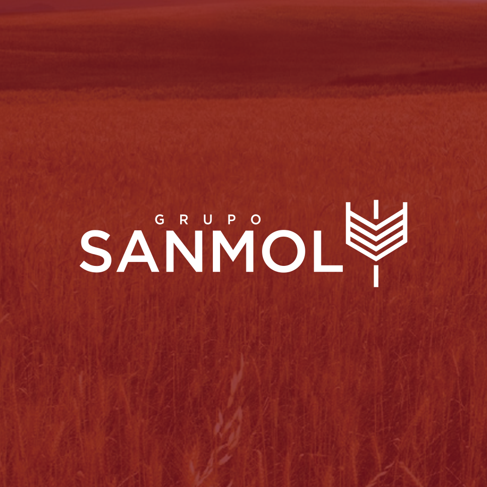
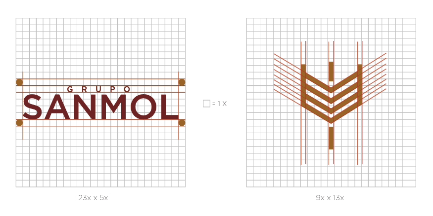
TROUBLESHOOTING / IDEA
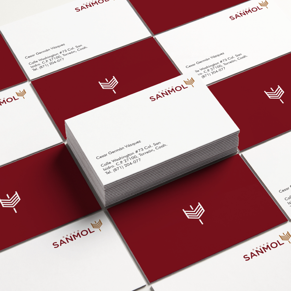
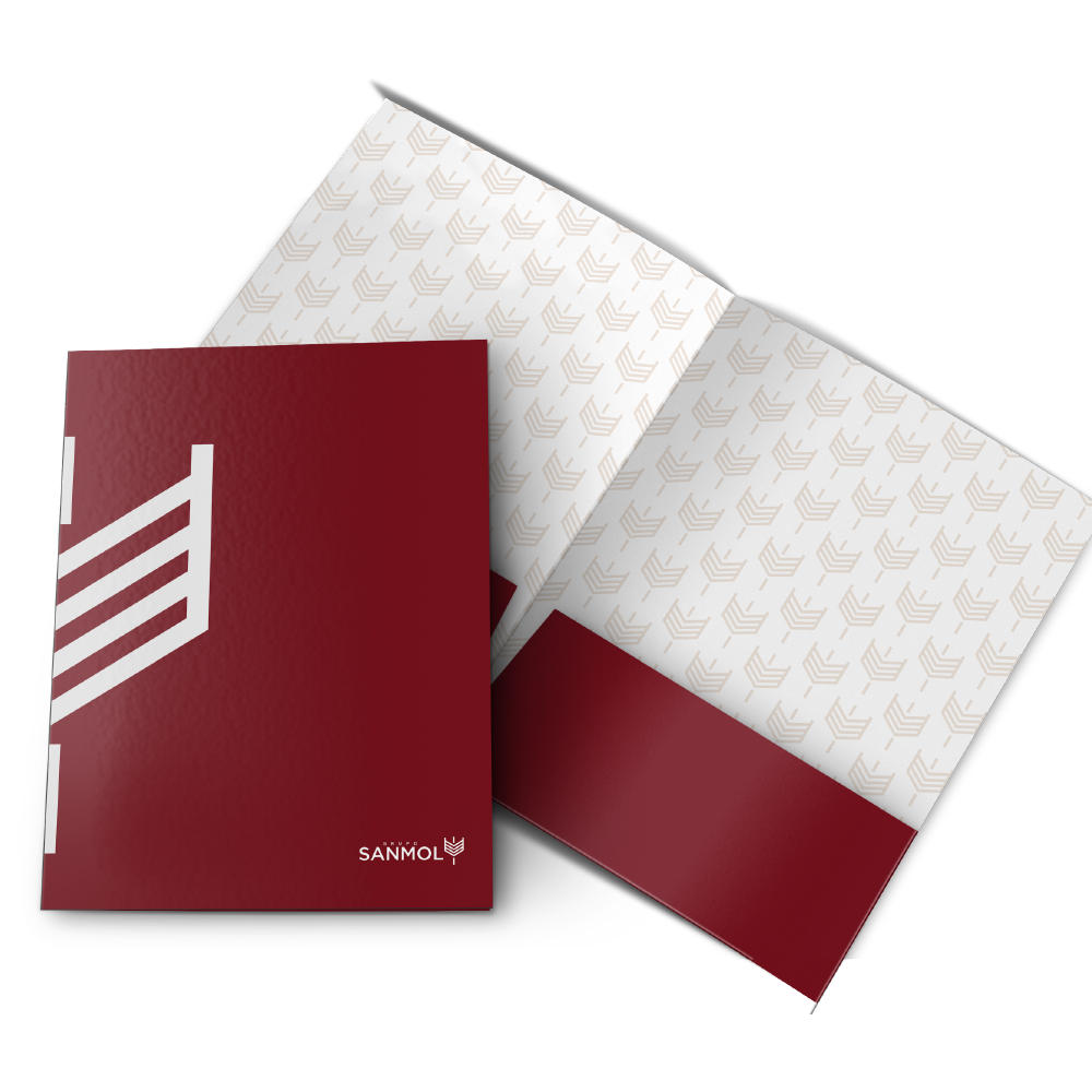
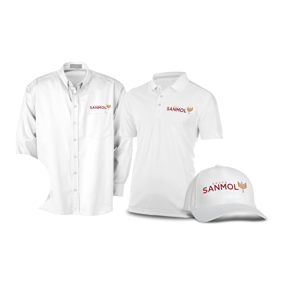
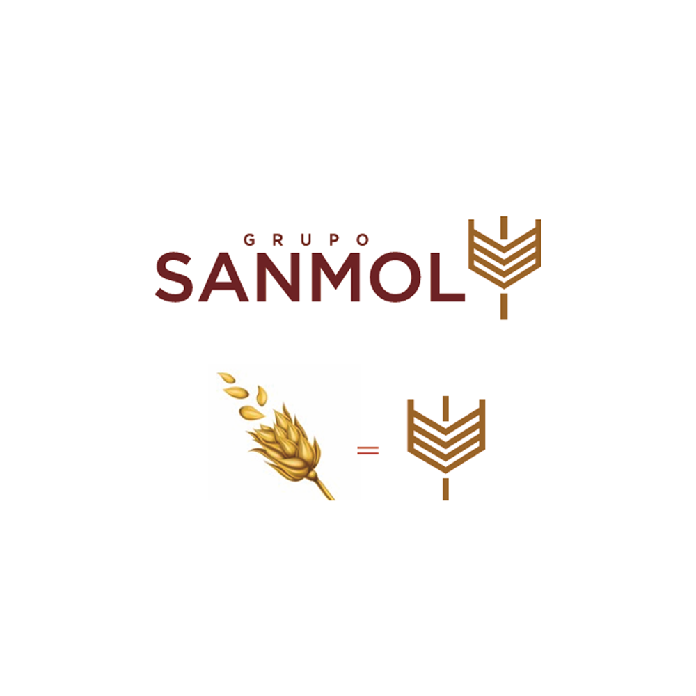
We created a symbol that emerged from the simplification of the wheat grain, along with a sober and elegant typography. This was done to transmit the essential values of the company through its branding.
RESULTS
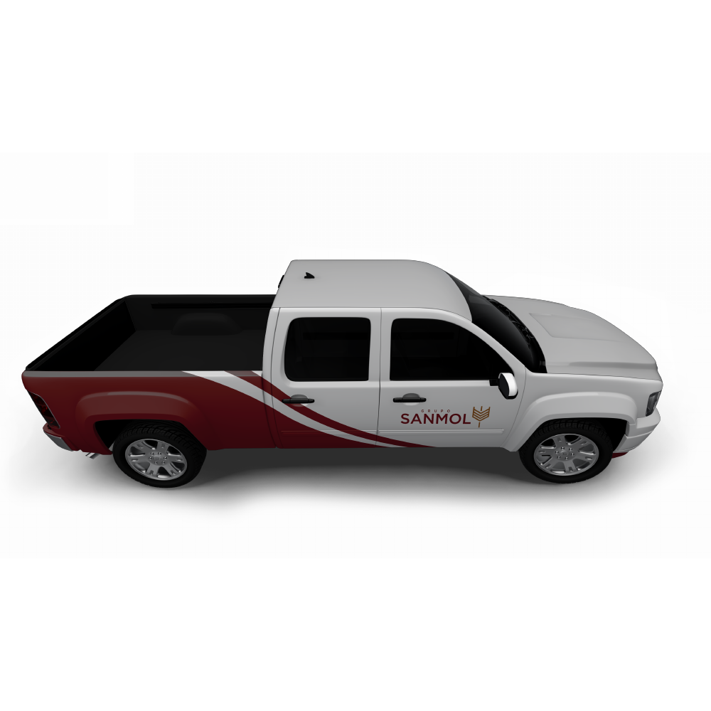
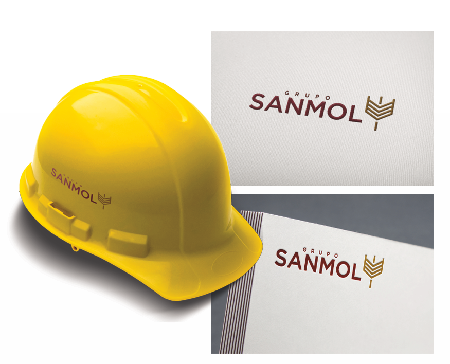
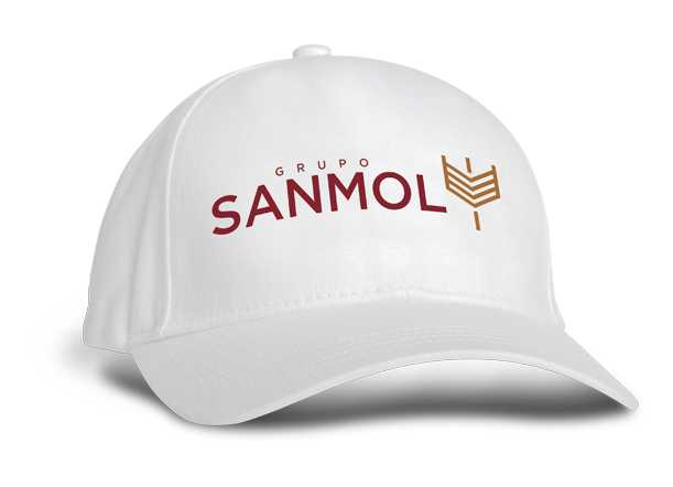
The redesign of SANMOL's image helped the company renew the perception that both their existing and new customers have about the company. It aimed to create a positive image of a company in constant evolution, always with the primary goal of nature conservation through best practices.